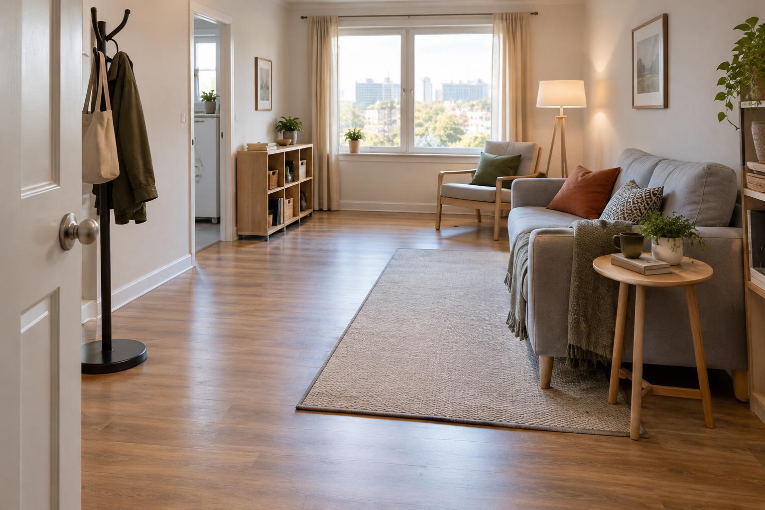
Start with what people need to find
In a care environment, someone may need to spot a door, locate a light switch, or distinguish the edge of a counter while doing something else. Contrast helps by making an object look different from the surface around it. The aim is not to make every feature stand out. It is to give useful features a clear visual place in the room.
Begin by walking through a space and noting decisions a visitor or regular user must make. Where is the door out? Which door leads to a washroom? Where does a floor change level? Which handle, tap, or control needs to be found quickly? These questions give color choices a purpose. If everything is equally bold, the most important details may be harder to pick out.
Think about lightness, not just color names
Two surfaces can have different colors yet look similar in dim light. A red door against a green wall, for example, may not stand out as clearly as expected if both appear equally dark. A noticeable difference in lightness or darkness is often a more dependable starting point than hue alone. A dark handle on a pale door, or a pale door against a darker wall, can create a boundary that is easier to see.
Look at each pairing where it will be used, under the room’s usual lighting. Daylight, evening light, shadows, and reflections can change the effect. Matte or low-sheen finishes may reduce distracting glare, particularly on large surfaces. Small samples can be misleading, so compare generous patches when possible and view them from the approach a person would actually take.
Make doors and changes in level legible
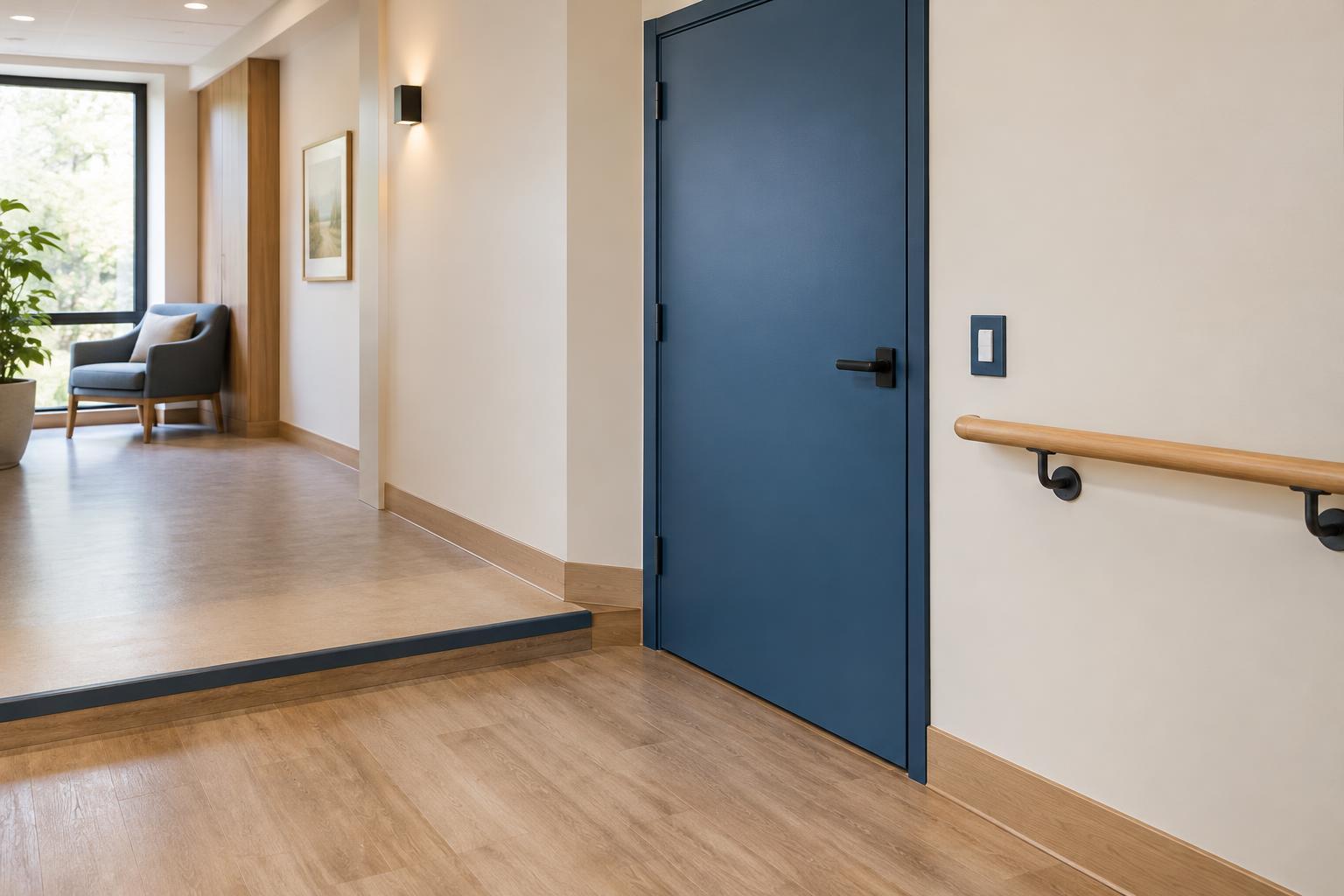
A door is easier to identify when its leaf, frame, or both are visibly distinct from the surrounding wall. The best choice depends on what needs emphasis: the doorway as a destination, the door panel as something to open, or the handle as the point of interaction. A handle should also contrast with the door itself. Nearby signs can add meaning, but they should not have to compensate for a door that visually disappears into the wall.
Changes in level deserve particular attention because an edge may be difficult to judge when adjacent surfaces blend together. A contrasting strip can help define an edge, provided it remains visible across its length and does not create a tripping hazard itself. Patterned flooring, strong shadows, and shiny surfaces can make boundaries look less certain. For steps, ramps, and other regulated features, check applicable requirements and involve a qualified designer or accessibility specialist rather than relying on color choices alone.
Help fixtures stand apart from their backgrounds
Everyday fixtures are easier to locate when there is a clear distinction between the object and the surface behind it. Consider a light switch against its wall, a tap against a basin or splashback, and a grab rail against the wall on which it is mounted. Contrast around the part a person needs to touch is especially useful. A dark mounting plate behind a dark control, for instance, may define the plate while leaving the control itself hard to find.
Keep the arrangement predictable. Put similar controls in consistent positions and avoid using color as the only clue to what they do. Labels, recognizable shapes, and straightforward placement can work alongside contrast. This matters where fixtures look alike but serve different purposes: a distinct color may catch attention, while a clear label explains the choice.
Test the whole space and maintain the effect
Before committing to a scheme, look through the space from seated and standing viewpoints and from common routes of approach. Notice whether an open door blends into a wall, whether a fixture falls into shadow, or whether a bright floor pattern competes with a step edge. If the space is already in use, invite feedback from the people who navigate it. Their observations can reveal problems a paint sample cannot.
Contrast is a feature of the whole environment, not a one-time paint decision. Replacement handles, repainting, worn edge strips, and changes to lighting can weaken a once-clear cue. Periodic checks help preserve the intended distinctions. A useful scheme is selective and consistent: important doors, edges, and fixtures are easy to locate, while the room remains calm enough to understand.