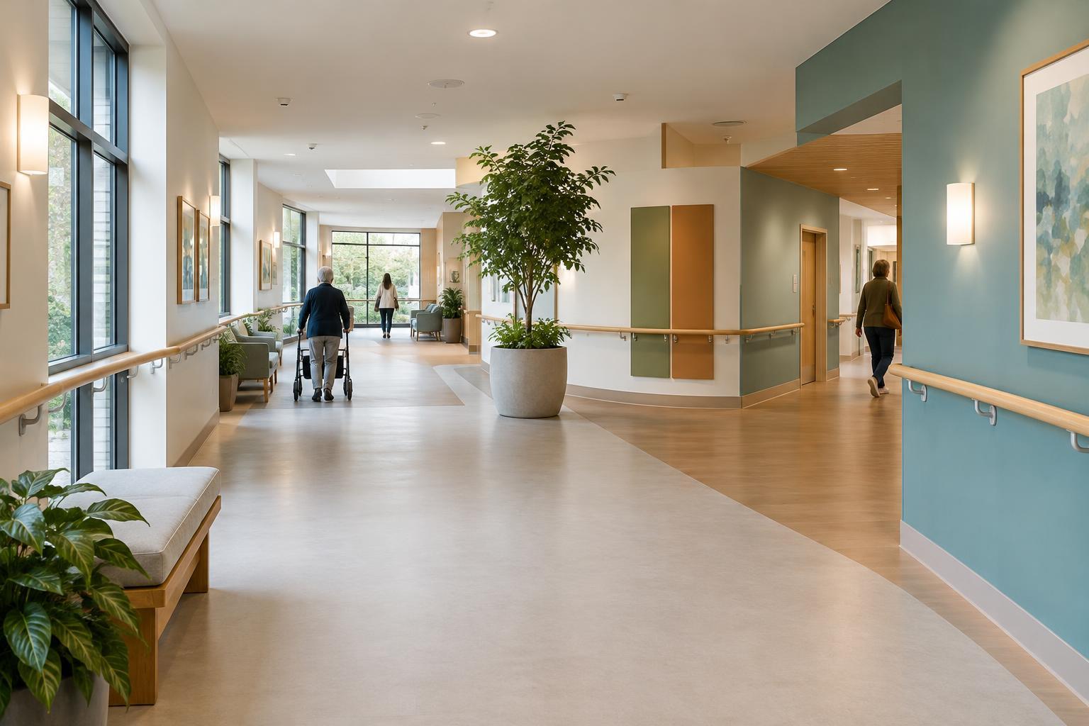
Start with the journey, not the sign
Finding a room begins before someone reaches its door. A visitor may need to identify the right entrance, cross a lobby, choose a corridor, and locate a destination among several similar doors. At each choice, the layout either helps them continue or makes them stop and guess. Good wayfinding considers the whole journey rather than treating signs as a final addition.
To review an existing space, walk a common route as though you have never visited before. Notice where you must choose between paths, where a destination disappears from view, and where two areas look alike. Repeat the walk from each entrance people actually use, including an accessible entrance if it differs from the main one. A sign that works from one direction may be hidden from another.
Keep the review focused on ordinary tasks: finding reception, a waiting area, a restroom, or the exit. Mark the places where someone would need reassurance that they are still on the right route. These observations give you a more useful starting point than adding labels to every available wall.
Make each decision point clear
The most useful information appears before a person has to turn, not after they have passed the junction. At a corridor intersection, for example, a directional sign should be visible on approach and should point clearly toward the next part of the route. After a turn, a destination label or another cue can confirm the choice.
Use the same name for a place on every sign, directory, appointment message, and door label. If a room is called “Check-in” at the entrance but “Reception” farther inside, visitors may wonder whether they are heading to the same place. Keep wording short enough to scan while walking, and avoid directions that depend on knowing the building already, such as “past the old desk.”
Check signs from realistic viewing positions: standing, seated, and approaching from either side of a corridor. A sign may be technically present but obscured by an open door, a display, or people waiting nearby. Legible lettering, strong contrast, and lighting that does not wash out the text all help people use the information.
Let the surroundings reinforce the route
Signs work better when the physical setting tells the same story. A clear sightline to reception, a distinct doorway, or a recognizable feature near a turn can make a route easier to remember. Landmarks should be easy to describe and unlikely to move. A permanent wall feature is more dependable than a freestanding display that may be relocated.
Color can help distinguish areas, but it should not carry the entire message. A visitor may not see a color as expected, and a color scheme can become confusing if similar shades appear in several places. Pair any color cue with a written name, a room number, or another consistent feature. The aim is to offer more than one way to recognize a destination.
Keep circulation routes visually calm where possible. Temporary notices, storage, and promotional materials can compete with essential directions. If a hallway contains many signs, make sure the information needed for navigation is the easiest to spot. A tidy route also makes doors, turns, and destinations more apparent.
Support arrival, changes, and the return trip
Wayfinding begins with knowing where to start. At each public entrance, a simple orientation point can show visitors where they are and which way to go for common destinations. If check-in happens somewhere other than the most visible desk, make that distinction clear at the entrance rather than expecting people to discover it later.
Consider what happens when the usual route is unavailable. A temporary closure needs directions at the point where a visitor would otherwise continue, followed by confirmation along the alternative path. Remove outdated notices when the route reopens; conflicting instructions can be harder to follow than no instructions at all.
The way out deserves the same attention as the way in. After an appointment or visit, someone may leave from a different room and face unfamiliar junctions. Check that routes back to the lobby, exit, and other useful facilities remain understandable from those starting points.
Test the route in everyday use
A floor plan can show where signs belong, but it cannot fully show how the space feels in use. Walk the route when doors are open, seating is occupied, and ordinary activities are taking place. Ask people unfamiliar with the layout to describe where they expect to go at each junction. Their moments of hesitation may reveal problems that regular users no longer notice.
Make improvements one route at a time. Start with a destination people frequently need, then check whether its name, signs, landmarks, and doorway label form a continuous chain. Revisit the route whenever rooms change purpose or furniture moves. Wayfinding is most reliable when it is maintained as part of the space, not treated as a one-time sign project.