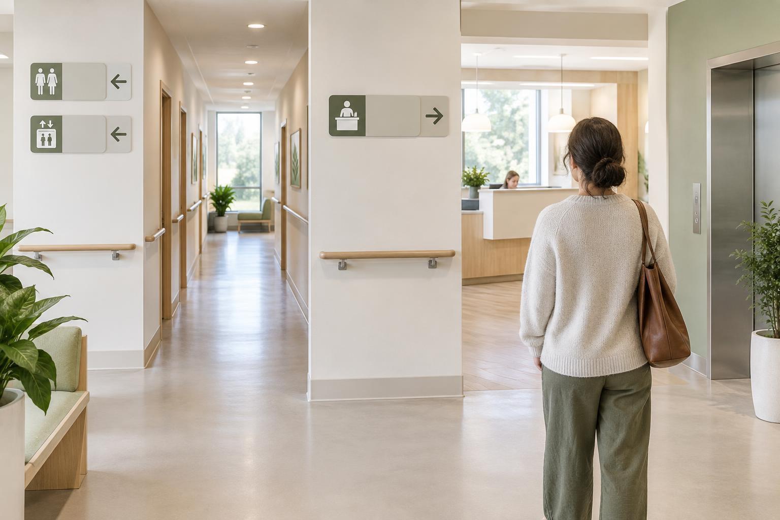
Start with the decision a visitor needs to make
A wayfinding sign is most useful when it answers a question at the moment it arises: Where do I go next? In a care environment, visitors may be looking for a reception desk, an appointment room, a restroom or an exit. Before writing a sign, identify the route and the places where someone must choose a direction. A short label and arrow at a corridor junction can be more helpful than a detailed directory placed after the turn.
Write for someone who has never visited the building. Staff may understand department names, room codes and local shorthand, but newcomers may not. Use the name a visitor is likely to have seen in their appointment information, and keep it consistent from the entrance to the destination. If that name is long or technical, consider whether a shorter public-facing label can be used consistently across signs and other visitor materials.
Choose words that are brief but specific
A sign should say enough to distinguish one destination from another, without becoming a set of instructions. “Reception” usually gives a clearer destination than “Enquiries”; “Accessible restroom” is more specific than “Facilities.” Where several reception desks exist, add a meaningful qualifier such as “Outpatient Reception” rather than relying only on a floor number. Use the same capitalization and wording throughout the route so visitors can recognize the label quickly.
Avoid asking symbols to carry information that words could clarify. A sign reading “Lift” beside a lift symbol supports people who know either cue. A symbol alone may leave someone unsure whether it marks a destination, a service or a direction. Conversely, a long line of text is harder to scan while walking. When a sign needs several messages, group related destinations or consider a directory at a place where people can pause.
Use symbols as confirmation, not a guessing game
Recognizable symbols can make signs easier to spot and can support visitors who read a different language or find written directions tiring. Choose familiar, simple images with a clear connection to the destination, such as a lift or restroom symbol. Avoid decorative icons whose meaning depends on knowing the organization. If a symbol could reasonably mean several things, pair it with a word label or select a less ambiguous image.
Treat words, symbols and arrows as one message. Place the arrow close to the destination it refers to, and keep that relationship consistent across signs. If an arrow appears between two labels, a visitor may not know which route it describes. Color can help distinguish areas, but it should not be the only clue: a written name and a clear symbol remain useful when colors are hard to tell apart or the sign is viewed in poor light.
Make the route consistent from start to finish
Wayfinding is a sequence, not a collection of isolated signs. At an entrance, people may need to find the main reception desk first. From there, signs can guide them through each turn and confirm when they have arrived. Repeat a destination label at important junctions rather than assuming that one early sign will be remembered. At the destination, use the same name on the door or nearby wall so visitors know they have reached the right place.
Placement matters as much as wording. Look for points where people naturally slow down or scan their surroundings, and check whether a sign can be seen before a turn must be made. Keep signs clear of visual clutter where possible. Printed directions, appointment messages and digital maps should use matching destination names; a visitor should not have to work out whether “Imaging,” “Scans” and a room code refer to the same place.
Check signs with a real journey
A route that feels obvious to regular staff may still be confusing to a first-time visitor. Walk it from the entrance using only the information available to a newcomer. At each decision point, ask whether the next sign is visible, whether its wording matches the destination, and whether its arrow is unmistakable. Check the return journey too: finding an exit can require different signs from finding an appointment room.
If possible, invite people unfamiliar with the building to try the route and describe where they hesitate. Ask what they think each symbol means before explaining it. Their observations can reveal unclear labels, missing confirmation signs or arrows that seem to point to the wrong corridor. Make one change at a time where practical, then walk the route again. Clear wayfinding grows from these small checks: familiar words, supportive symbols and a consistent path people can follow with confidence.